Like fashion designer Rachel Zoe once said: ‘Style is a way to say who you are without having to speak.’ Every year, the fashion industry keeps an eye on the Fashion Week in London and New York to catch glimpses of the colour trends of the season. From classic British sensibility to vibrant colours, you will get a wide range of colours in fashion for fall 2020. Great importance is attached to the expression of optimism, humour and determination, but also creativity and confidence. It can be assumed that the colour trends for this quarter will again counteract central social phenomena of the year.
The Pantone Color Institute, a consulting agency for trend forecasts and colours, has summarised and commented on the colour trends of the Fashion Week. In this article you will learn everything you need to know about them.
1) Red
The Mandarin Red (left) has a strong orange undertone and seems rather provocative. Although red tones can be aggressive, this is not the case with Mandarin Red. In combination with black jeans or white chinos, the eye-catching tone becomes suitable for everyday use.
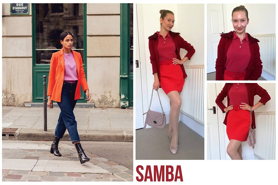
Samba is a passionate and seductive tone with an energetic aura. The name is derived from Brazilian dance and is a real eye-catcher, especially in combination with other red tones. Even tight jeans and boots can be combined well with it.
2) Bordeaux
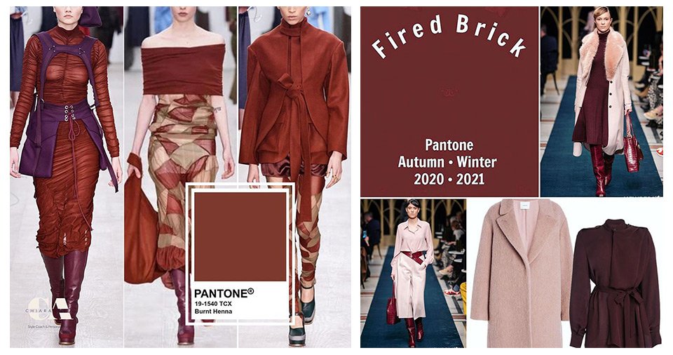
Burnt henna is an earthy tone and is particularly admired for its robust effect. It is powerful and offers many possibilities for combination. While the Fashion Week has tended to work with various checked patterns and striking fabrics, the tone works very well with purple trend pieces. Cream-coloured accessories also bring it to the fore.
Just like Burnt Henna, Fired Brick is a Bordeaux tone and can be worn in combination with other tones such as cream or light pink as well as tone in tone. It looks very sophisticated and yet expressive.
3) Orange
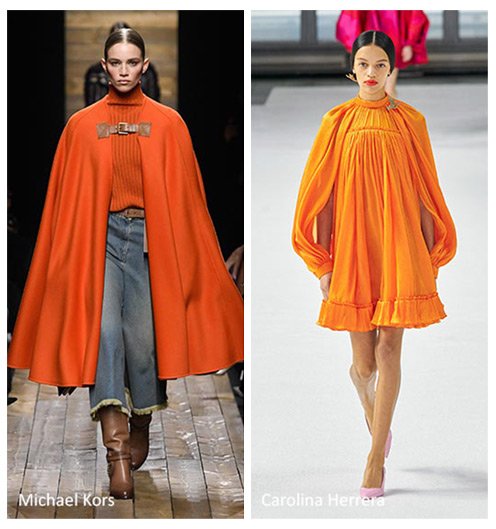
As a rather unusual fashion colour this year, orange can be distinguished between Exuberance (left) and Amberglow (right). The former has a touch of sympathy and happiness and should be combined with simple colours like black or white. The mere sight will put you in the mood for autumn.
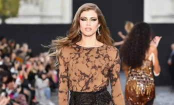
Amberglow is a combination of yellow and orange. The light but by no means garish tone gives you the feeling of fading summer that turns into a calm autumn. During Fashion Week, Amberglow was combined with materials such as latex or PVC, which gives the soft tone an exciting touch.
For both orange tones, navy blue or olive green can also be exciting combinations.
4) Beige
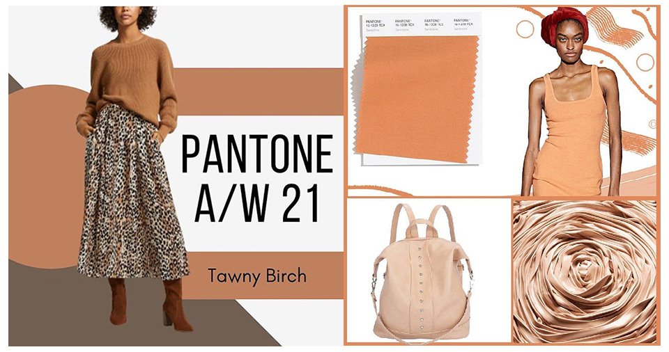
Similar to the nude collections in the make-up trends, this year we distinguish between Tawny Birch (left), Sheepskin (centre) and Sandstone (right). In general, nude colours are very versatile. Whether eye-catching patterns, great fabrics or cuts, beige is a colour that allows open interpretations and is often considered a feel-good colour.
Tawny Birch is very neutral and has a ligneous touch that reminds of the colder season. Summer has already passed, and you can unpack your winter boots. Sheepskin will make you think of the woolly fur of sheep. It is a very rich tone that radiates a touch of warmth and security. Sandstone is associated with a warm and sandy climate. For the cold autumn days, it seems a bit out of place, but in combination with white or darker brown tones it can create a real vintage flair.
5) Pink
A related colour to beige is pink, which has gained much popularity this year. Although it is always considered a feminine colour, its mature effect is particularly striking. The two different versions of this colour are Rose Tan (right) and Peach Nougat (left). The latter has a peachy undertone. Both colours are especially magnificent when worn tone in tone, but black lace is also an eye-catching combination.

6) Purple
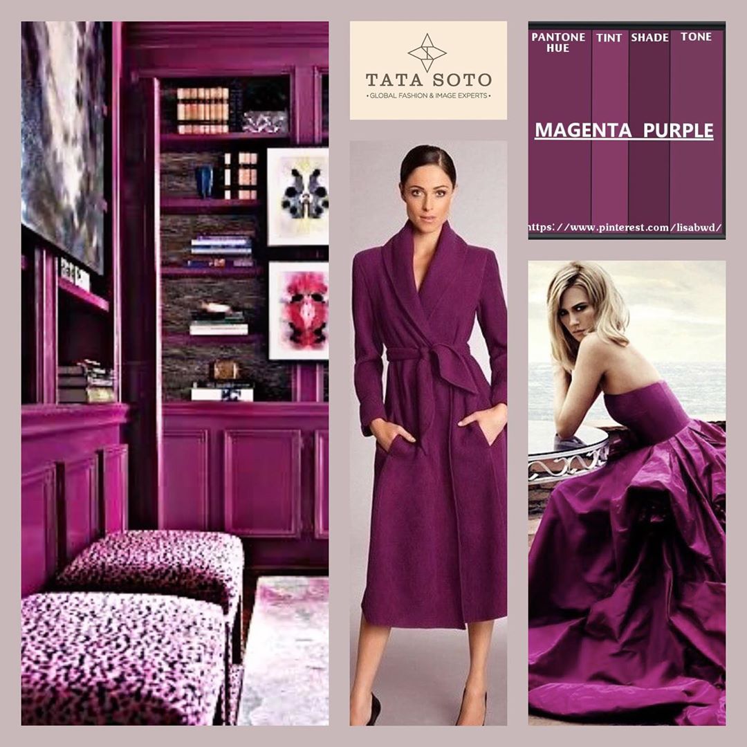
With this year's shade of purple Magenta Purple, a very exciting trend colour became modern. The colour has stood for equality between the sexes for decades and is associated with freedom, independence and feminine strength. In combination with simpler colours such as white, black, beige or grey, it is very expressive. Purple is also known as a royal colour.
7) Blue
Royal blue is also a very elegant colour and the fashion designers have shown a particularly large number of different tones of blue this year.
Starting with Classic Blue (left), the tone corresponds to its name. With its classic yet versatile characteristic, it is a real eye-catcher in terms of form and combination. For the autumn, coats in this colour are particularly modern. The one or other ball gown was also shown on the catwalk.
True Blue is darker than Classic Blue (centre) and is described by Pantone as clear, consistent and faithful. It also resembles more a navy blue, which is why it can be combined wonderfully with some light red tones. On the catwalk the colour dominates as a fur coat.
The Strong Blue (right) is by far the brightest tone of blue among this year's tones. With its playful and creative touch, it is associated with self-confidence. On the catwalk it became a real highlight in combination with silk.

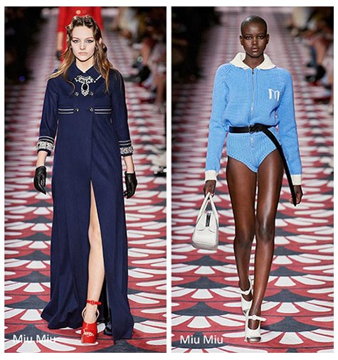
Night Blue (left) is similar to black and looks just as saturated. With its elegant quality this colour is especially beautiful as a jumpsuit, trench coat or dress. Many designers call it a key colour in this year's collection. As a tribute to the vastness of the ocean, Night Blue is divided into Dress Blues and Blue Depths and is described as mysterious. Red tones are also popular in this combination. The only bright representation of a blue tone is the Powder Blue (right). With its calm effect, it radiates innocence and youth, but it does have a certain variance between designers.
Each of these blue tones has different effects, but all of them are still often combined with grey, off-white or cream.
8) Green
Although green is a fading colour in autumn, it has a unique position for designers this year. With Ultramarine Green (left) they present a shade that has a very lively and classic effect and manages to become a real star. For Pantone, it seems confident and ready to do great things. The presentation on the catwalk was done with simple grey tones. Ultramarine Green is simply a bold colour tone with great fabrics and cuts.
Military Olive (in the middle) made its comeback this year, after being seen everywhere a few years ago in connection with the well-known military pattern. This time, however, the pure olive green colour is in vogue. Diversity in fabrics such as leather or silk is particularly striking on the catwalk. The cuts and types of presentation also vary between long one shoulder dresses, coats and jumpsuits. It is a strong colour with character and allows the person wearing it to look very bold with colours like orange, yellow or pink. However, classic colours like white, cream or gold are also possible.
Pear Green (right) is a lively, wholesome tone and is considered a colour between Green Sheen and Military Olive Green. Despite its cheerful effect, it can look very elegant with black and is therefore a great alternative colour for a classic evening event.

9) Yellowish-green
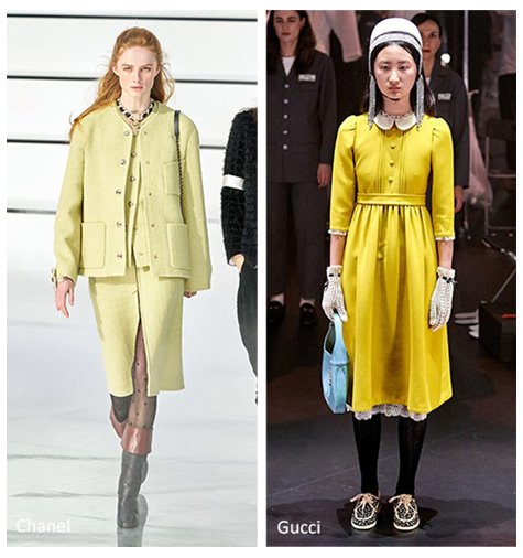
Green Sheen (left) also definitely has an avant-garde character and catches the eye as a striking colour tone with a hungry and warm effect. The colour tends to be yellow with a slight green shimmer. In combination with blue tones and silk gloves this tone is simply fabulous.
Another yellow-green tone is Celery (right), which resembles Green Sheen but is a softened version of it. Labels such as Chanel presented the look in their opening and focused on long coats in a tweed look.
Yellow-green tones are working well with blue, grey and especially brown.
10) White
In contrast to the other colour trends in autumn 2020, white appears as an outsider. Nevertheless, the colour tone found representation on the catwalk by means of two variations, as the focus was mainly on the message. With Jet Stream (left) a cream shade was chosen for this purpose. Designers such as Molly Goddard or Jacquemus were able to create unique looks, which were very popular not least because of their eco-friendly materials. Pantone also describes the tone as raw and recycled.
Furthermore, Almond Oil (right), the second shade of white, returned. It is considered warm, soft and appetizing. Inspired by the almond, it shows the vegan character of the nut. Although the colour is rather rustic, it can conjure up new alternative looks in combination with silk or tulle.

11) Grey
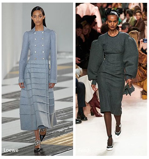
The timeless grey was also represented in some places in form of two shades. On the one hand, Sleet (left) is titled as a light and cool grey, which is definitely not seasonal. Givenchy or Christopher Kane showed this in their show and used fabrics such as satin or wool to emphasise the strength of the colour.
On the other hand, Asphalt Grey (right) with its dark and wicked quality is a counterpart to Sleet. Although both were mainly seen in the form of coats on the catwalk, their appearance differs. Especially in the Fendi collection the colour was strongly represented.
With the most important colour trends of the autumn and winter season you can now get creative. Whether Givenchy, Fendi or Chanel, the catwalk is full of modern interpretations with the aim of making the year a little more cheerful.

